30 January 2011

P2 Project: Exploring coloured media - Check and Log

Which of the media you have experimented with did you find most expressive. Make notes in your learning log on the pros and cons of each medium.

I have found pencil to be t most expressive. You can use pressure or density of lines / hatching / shading to express different textures and tones.

Pros and Cons of Pencil: Pencil is very flexible and easy to work with and great for detail drawing. Also you can rub out mistakes. but it is hard work to work large areas and you can't smear pencil to create a blended effect.

Pros and Cons of Charcoal: I do not like charcoal at all - too messy for me so no pros for I'm afraid.

Pros and Cons of Pastel: I don't think i used pastels correctly. I used them on a smooth paper so they seemed to stick and be bitty. Having researched using pastels on the Internet, I have learnt that pastels work best on rough paper. It's very hard to erase though it smears and blends pretty easily. 

Pros and Cons of Watercolour: I could not make my watercolour pencils work. I need to do more research to understand. I have seen the effects of watercolour pencils and love the delicate colour wash effect they can give. I love the idea that you can get a watercolour effect without using a brush.I will be persevering with this method.

Pros and Cons of Ink: I quite like ink but can see problems in its permanence. For detail drawing it is great bu if you make a mistake, that's it.

Which medium do you think lends itself to very detailed work?

Definitely pencils and ink

Which techniques, tools and effects do you particularly enjoy? Make notes about your experiments.

I find cross hatching easy to do but difficult to get the right effect. I need to practice a lot more. I liek drawing lines - this tend to be how I doodle. I also really like shading using the side of the pencil because you can fill a large space quickly. In general though, I think I am doing OK.


25 January 2011

P2 Project: Exploring coloured media exercises

I enjoyed this start to Part 2. I used all the varieties of coloured pencils / pens / crayons I had and it was tremendous fun. I really like using colour and think this will be the direction I follow.


PART 2 OBSERVATION IN NATURE - THE START

Assignment 1 was posted off last Thursday, just in time for the deadline of Friday! And what a great sense of satisfaction I felt. I had a bit of a panic when I realised that BLOGGER has no PRINT facility but the office assure me that it is not necessary to print off the Blog.

And so onto Part 2 Observation in Nature.

What I have learnt from working through Part 1, is that I must read through the whole of the Project section right through to the end of the Check and Log questions before starting any of the exercises.

I am looking forward to starting this next part.

20 January 2011

ASSIGNMENT 1 REFLECTIONS


Assignment 1 - First Drawing Natural Forms

Assignment 1 - Second Drawing Man Made Objects


Did you do enough preliminary work before starting work on your final piece?

No, is the simple answer. I was anxious that I would have to rush the assignment, so I spent quite a lot of time thinking about it, about what I was going to draw so that by the time I was ready to do it, I had already decided in my mind what I wanted to do. I did not document these thought processes so when I came to do the assignment, I was already doing the preparatory work in retrospect, if that makes sense. I did however go through the motions of doing the rough sketches as described in the assignment. I did find it useful to look at the sketch and before starting the actual assignment drawing to consider what techniques I had learnt in the past few months and how I was going to incorporate them. By doing the rough sketches, I also decided I would do the assignment in colour which made me check all my pencils and collect together a good selection of shades etc. So although in drawing terms I don't think I did enough prelim work, in thinking terms I was well prepared and knew what I was going to do before starting the assignment.

Do your large drawings give an accurate interpretation of the still life groups? If not, what went wrong?

I am extremely pleased with my results. Three months ago I had never drawn anything. Even at school I was transferred from the painting class to the textile class at 14 years old because I was not good enough at drawing / painting. I cannot believe that I have produced the drawings. I am really pleased with my results but realise that they probably fall very short of undergraduate work so I welcome all feedback.

Did you make a good selection of objects or did you try and include too much? Would you change the arrangements of the objects if you were to start again?

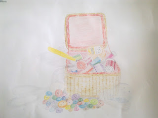
The first still life I did was the basket of threads with buttons. I think I made a good selection of objects but there were too many (& unnecessary) buttons!. I chose the basket to practice frottage and produce texture, the scissors to produce an interesting shadow, the daylight light bulb to introduce transparency, the rayon threads because their sheen surfaces reflect light nicely and the buttons to try and cheer up the drawing and have something at the base of the basket. There were too many buttons in the end but I liked the bright and cheerful dimension they gave to the drawing.

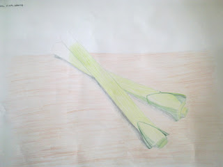
The second still life were the leeks and I deliberately chose only 2 to give me a good change to study the natural shadows, reflections and textures which I knew I would find more challenging to do. I also saw the opportunity to do some negative space technique.

Do your drawings for well on the paper or could they be improved by working on a larger sheet of paper?

I was at the limit of my comfort zone drawing on A2 paper. I don't think at this stage of my learning I could produce anything on a larger piece of paper without a lot of practice first.

Did you have problems with drawing or find hatching too difficult.

No. These are all new skills to me. I am the sort of person who thinks that there is no reason why I should not be able to do something so it would not occur to me to think that I am having a 'problem' with any of the learning. My view is that I am learning new skills, am comfortable with what I am learning and however I learn and whatever skill I develop it will be to the best of my ability at that moment on time. I am a positive person when it comes to learning.

P1 Project: Enlarging An Image - Check and Log

How successful were you in copying the lines from the smaller squares tot he larger squares?

Fairly successful. I was pleased with the results. This technique appealed to my mathematical brain. I found the technique easy to do.

Are you satisfied with your larger replica of the image/ What would you do differently another time?

Yes, I am satisfied with the results so I am not sure I would do things any differently next time.

P1 Project: Using Textures - Check and Log


Have you discovered any new ways of using your drawing tools to depit surface and texture

Using lines and marks, crossing and cross-hatching builds texture. Also using the side of the pencil lead as well as the tip created different effects. Also using colour and rubbing the paper over a textured surfact created interesting results. I used a corrugated paper surface (give to me to protect a hot cup of coffe from a take-out cafe) and then realised that at home I had interesting baskets, conservatory furniture which could laster be used as a basis for interesting textures.

I guess also different types of paper might produce intersting textures and perhaps markig the surface of the paper might do as well - eg scratching it, etc. Or some papers may be rougher / smoother than others.

so my conclusion is yes, I have discovered new ways of using my drawing tools.

How successful were you at implying form with little or no tonal hatching?

I have to say I was tired when I did the drawings for this project so was not at my best. The assignment has been taking up most of my thoughts and I've wanted to get through these last sets of exercises quickly to make sure I have plenty of time and a peaceful mind to do the assignment. So, the results of this exercise were not great and I learnt by that.

What are your impressions of frottage as a drawing technique?

Simply - I LOVED IT. I loved doing this and it will be a technique I use in my assignements.

8 January 2011

P1 Project: Still Life - Check and Log


Do you think it is easier to suggest three dimensions on man-made or natural objects?

I think it is probably easier to suggest three dimensions on man-made objects rather than natural objects. The reason being that man made objects are mainly produced from geometrical shapes eg cubes, cylinders, cones often with regular shapes and lines which are easier to represent and draw whereas natural objects are often irregular so the three-dimensional aspect of them is more subtle.

How did you create a sense of solidity in your composition.

In the drawing of the man-made objects, I used a soft 4B pencil and different density of hatching to create depth and solidity. In the drawing of the natural objects, a collection of cheeses, I used different shades of yellows, oranges, browns and reds to produce effects of solidity.

Do you think changing the arrangement of your composition makes a difference to your approach and the way you create a sense of form?

Yes. It is interesting how some arrangements don't feel comfortable to draw but others do. Often it is about perspective and seeing how shadows fall.

How did you decide to position yourself in relation to the objects?

Firstly feeling comfortable is very important, then having light sources in the best positions to highlight the forms, shadows, colours. Also being able to see the shapes in a form that I recognise I can draw is important.

P1 Project Reflected Light - Check and Log

What are the difficulties in separating cast shadow from reflected light and shade?
My drawing was of a collection of  kitchen implements - a colander, saucepan lid, ladle and saucepan hidden under colander and saucepan lid. To differentiate between light and dark tones, I half closed my eyes and noted that the reflections on the dull metal of the colander were more diffused than on the highly polished saucepan lid. The primary light source (a ceiling light) produced strong, sharp clearly defined shadows beneath the kitchen implements. Reflections were noted on the surfaces of the implements which were more difficult to draw.

The reflected shadow and light follows the contours of the objects. How have you shown this in your drawing?

Cross hatching with a softer 4B pencil drawing more emphasis where the shadow is darkest.

P1 Negative Space Research - Patrick Caulfield

Patrick Caulfield

Patrick Caulfield's seemingly anonymous painting style is instantly recognisable. Although he disliked being identified with a particular art movement, he is often associated with British Pop Art because his subjects are often commercially produced or kitsch. However, unlike Pop Art he wasn't interested in social realism or social comment and nor was his subject matter obviously contemporary or overtly American.  Instead, he chose subjects that were ambiguous both in tone and context, such as images taken from manuals or clichéd holiday destinations directly lifted from postcards.  His paintings look like commercial advertising or a painting-by-numbers illustration because he removes all visible brush marks, limits his palette to bright bold colours in commercial gloss paint and surrounds his patches of flat colour with strong black outlines.  Caulfield's painting style was in part a reaction to the highly personalised painting style of Abstract Expressionism, but he was also strongly influenced by Fernand Leger and the Cubist painter Juan Gris.
Caulfield's domestic interiors are often lifted directly from 1950s interior decorating magazines and they retain their original aspirational mood.  Devoid of narrative, Caulfield nevertheless imbues each canvas with a powerful emotional register by suffusing them with a dominant saturated colour. Frequently melancholic, these interiors are always totally still and without a human presence except maybe for a light left on. 
Many of his interior scenes also play with methods of portraying different forms, combinations and sources of light. He also incorporates trompe d'oeil and photorealistic elements in order to playfully explore the relationship between notions of reality, artifice and illusion.  Caulfield was interested in showing how no one method of representation within an artwork can claim to be more or less 'real' than another.  Interior with a Picture is a good example of one of Caulfield's interior scenes.

http://www.tate.org.uk/imap/imap2/pages/caulfield.html

P1 Project: Tone and Form - Check and Log


Now that I am in the swing of this course, my blog from now on will be purely about my learning.

How difficult did you find it to distinguish between light from the primary light source and secondary reflected light?

I had no difficulty in distinguishing between the primary light source and secondary reflected light as I understand how these are formed - explained in more detail below.

How has awareness of light and shade affected your depiction of form?
I have learnt that shadows are formed in an area where there is no light on it. It is distinctive because the area surrounding the shadow has light and so there will be a visible contrast. The shadow will produce a distinctive shape which may change depending on where the light source is positioned. A reflection on the other hand is caused by light reflecting from one surface to another so a reflection may contain the image of whatever is being reflected. In terms of depiction of form - a shadow is distinguishable as being wherever there is an absence of light and will be behind the object's light source whereas a reflection will be more subtle with a much greater variety of tones.

P1 Tone and Form Research - Odilon Redon

Redon, Odilon (1840-1916) was a French painter and graphic artist, one of the outstanding figures of Symbolism.

He had a retiring life, first in his native Bordeaux, then from 1870 in Paris, and until he was in his fifties he worked almost exclusively in black and white, in charcoal drawings and lithographs. In these he developed a highly distinctive repertoire of weird subjects (strange amoeboid creatures, insects, and plants with human heads and so on), influenced by the writings of Edgar Allen Poe. He remained virtually unknown to the public until the publication of J.K. Huysmans's celebrated novel A Rebours in 1884; the book's hero, a disenchanted aristocrat who lives in a private world of perverse delights, collects Redon's drawings, and with his mention in this classic expression of decadence, Redon too became associated with the movement.

During the 1890s Redon turned to painting and revealed remarkable powers as a colorist that had lain dormant. Much of his early life had been unhappy, but after undergoing a religious crisis in the early 1890s and a serious illness in 1894-95, he was transformed into a much more buoyant and cheerful personality, expressing himself in radiant colors in mythological scenes and flower paintings. He showed equal facility in oils and pastel. The flower pieces, in particular, were much admired by Matisse, and the Surrealists regarded Redon as one of their precursors. He was a distinguished figure by the end of his life, although still a very private person.

(http://www.ibiblio.org/wm/paint/auth/redon/)