After much deliberation, I decided to withdraw from this course. I was strugglilng and it was pointed out to me that I needed to do much more in the form of studies, prelim sketches etc. It became too much.
Thank you to everyone who looked at my work.
3 April 2011
30 March 2011
P2 Project Detailed Observation - Check and Log
I seem to have been at this stage for ages. I have been. It's taken me a long time to get through this section because I decided that to improve my skills, I would benefit from redoing the assignment 1 exercises and also that my learning log needed jazzing up.
My learning strategy is to alternate new assignment 2 exercises with old assignment 1 exercises. This seems to be working.
So now to the Check and Log questions in this section.
Which drawing media did you find most effective to use and for which effects?
I found that drawing pens are good for recording detail but are very permanent and if you make any mistakes you can't correct them. They produce even width lines and are good for shading and stippling.
I found graphite very flexible and easy to work with. I've now invested in quality pencils which are better because they have strong leads and you can maintain a sharp point. You can also use an eraser to correct mistakes. I found using the watersoluble pencils good fun and I liked the effect the faint colour wash made.
Did you enjoy capturing details or are you more at home creating big broad brush sketches.
I enjoy capturing details more than big broad brush sketches. I like concentrating on the detail of a small area.
Look at the composition of the drawings you have done in this project. Make some sketches and notes about how you improve your composition.
A technique to improve composition would be to choose good objects, preferably interesting ones, make sure that the proportions of the objects work well together, consider the placement of the objects, look at lines created by the objects, balance positive and negative space, add contrast, remove unnecessary distracting details and balance colours carefully.
Did doing a line drawing get you to look at space more effectively.
Yes. I also found that drawing in a larger space ie A3 meant that more detail could be captured.
Overall I am pleased with what I learnt my going back to the basics of Assignment 1 and being more observant in this section.
27 March 2011
Another attempt at P1 Study of light reflected from one object to another exercise
Another go at Assignment's 1 Study of light reflected from one object to another exercise. Pleased with the results.


| Study of light reflected from one object to another |
23 March 2011
P2 Contrasting Style Research - Two artists who work in contrasting ways
I m trying as much as possibel to include in research artists whose work I am able to see & study for real. For this exercise my two artists are going to be Piet Mondrian (tight and rigorous) and Ludwig Kirchner (sketchy and expressive). At the Tate Modern I saw Kirchner's Bathers @ Moritzburg and Modrian's Sun Church in Zeeland. Unfortunetly neither of these pieces of work are in Bridgemaneducations's online library so I have included other examples of their works instead.
Piet Mondrian

http://www.bridgemaneducation.com/ImageView.aspx?result=27&balid=221010
Piet Mondrian (Pieter Cornelis Mondiraan 1872 - 1944) was a Dutch artist born in Amersfoort. He was associated with Ven Doesburg in founding the De Stijl movement in architecture and painting. He began by painting landscape in a traditional sombre Dutch manner but after moving to Paris in 1909 he became under the influence of Matisse and cubism. He then began painting still lifes which are analysed in terms of the relationship between outlines and the planes. In the hands of Mondrian these became increasingly abstract so that eventually the patterns became more important than the subject itself. During World war I he discarded the subject altogether and concentrated on constructing grids of simple black lines filled in with primary colours. These rectilinear compositions depend on their beauty on the simple relationships between the coloured areas. He was a great theoretician and in 1920 published a pamphlet called Neo-Plasticism which inspired the Dutch philosopher Schoenmaekers. He went to London in 1938 and from 1940 lived in New York. Mondrian's work has been a major influence on all purely abstract painters.
Ludwig Kirchner

http://www.bridgemaneducation.com/ImageView.aspx?result=8&balid=117381
Ernst Ludwig Kirchner (1880 - 1938) was a German artist born in Aschaffenburg. He studied architecture at Dresden but became the leading spirit in the formation of Dresden, with Erich Heckel and Karl Schmidt-Rottluff, of 'Die Brucke' (The Bridge) (1905 - 13, the first group of German Expressionists, whose work was much influenced by primitive German woodcuts. His work was characterised by vibrant colours and angular outlines. He moved to Switzerland in 1914. Many of his works were confiscated as degenerate by the Nazis in 1937 and he committed suicide in 1938.
Piet Mondrian
http://www.bridgemaneducation.com/ImageView.aspx?result=27&balid=221010
Piet Mondrian (Pieter Cornelis Mondiraan 1872 - 1944) was a Dutch artist born in Amersfoort. He was associated with Ven Doesburg in founding the De Stijl movement in architecture and painting. He began by painting landscape in a traditional sombre Dutch manner but after moving to Paris in 1909 he became under the influence of Matisse and cubism. He then began painting still lifes which are analysed in terms of the relationship between outlines and the planes. In the hands of Mondrian these became increasingly abstract so that eventually the patterns became more important than the subject itself. During World war I he discarded the subject altogether and concentrated on constructing grids of simple black lines filled in with primary colours. These rectilinear compositions depend on their beauty on the simple relationships between the coloured areas. He was a great theoretician and in 1920 published a pamphlet called Neo-Plasticism which inspired the Dutch philosopher Schoenmaekers. He went to London in 1938 and from 1940 lived in New York. Mondrian's work has been a major influence on all purely abstract painters.
Ludwig Kirchner
http://www.bridgemaneducation.com/ImageView.aspx?result=8&balid=117381
Ernst Ludwig Kirchner (1880 - 1938) was a German artist born in Aschaffenburg. He studied architecture at Dresden but became the leading spirit in the formation of Dresden, with Erich Heckel and Karl Schmidt-Rottluff, of 'Die Brucke' (The Bridge) (1905 - 13, the first group of German Expressionists, whose work was much influenced by primitive German woodcuts. His work was characterised by vibrant colours and angular outlines. He moved to Switzerland in 1914. Many of his works were confiscated as degenerate by the Nazis in 1937 and he committed suicide in 1938.
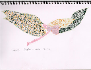
P2 Stipples and Dots exercise
Had 3 attempts at this to try out different drawing pens / fibre pens. The first drawing was of some leaves of a spotted laurel , the second a bowl of strawberries and the third, a few strawberries just on a table.
 |
| Stipples and Dots - Spotted Laurel |
 |
| Stipples and dots - bowl of strawberries |
 |
| Stipples and dots - strawberries on a table |
20 March 2011
Richmond Printmakers at 20 Exhibition
As I learnt yesterday, you don't have to go too far to see a good exhibition. This one was the Richmond Printmakers at 20 Exhibition (http://www.richmondprintmakers.co.uk/) hosted by The Stables Gallery at Orleans House, Twickenham (http://www.richmond.gov.uk/home/leisure_and_culture/arts/the_stables_gallery.htm).
It was an anniversary exhibition to celebrate 20 years of creative activity. Past and present Richmond Printmakers displayed their work and workshops demonstrating the many different methods of printmaking were also on offer.
My favourite a print called The Heron by Tessa Charles (http://www.tessacharles.co.uk/). I loved the subject, the colours, the design. The whole print was a delight to see and I was sorry that all copies of it had been spoken for.
 |
| The Heron by Tessa Charles, printmaker |
16 March 2011
Tate Visit Collage
Picking up on point my tutor made in my Assignment 1 feedback that it would help me to look at art asking the question 'how did the artist do that' rather than observe art as a connoisseur, yesterday I made my first visit to the Tate Modern (London). Whilst I have seen the outside of this magnificent building many a time as I've trotted up and down the Thames on many a river cruise with the grand-children, I've never seen the inside. I was lucky enough to go with a friend who is an artist and she guided me through.
First of all we saw the Ai Weiwei Sunflower seeds installation- all 100 million of them! The installation itself did nothing for me until I saw the accompanying film which put the whole thing into context and explained how each seed had been individually sculpted and painted by specialists working in small-scale workshops in the Chinese city of Jingdezhen. Quite something.
I had prepared for the visit by making a list of artists that had been mentioned so far in the course literature and noting which ones had works being exhibited in the Tate. I was able to see quite a lot of works from Picasso to Matisse from Max Ernst to Juan Gris and it was a huge revelation to view art as my tutor had suggested. Seeing for example the Frottage pieces of Max Ernst (The Entire City - oil on paper laid on canvas and Dadaville - Painted plaster and cork laid on canvas) was extremely enlightening and I learnt the difference between seeing art for real and as an online display.
Sadly there were only a few drawings on display but there was one by Picasso (Faun Revealing a Sleeping Woman - Etching and aquatint on paper). Although I appreciated the techniques that had gone into creating this masterpiece, I'm afraid it did nothing for me - probably because I just didn't like the subject - a faun.
But we did get to see Picasso's Nude, Green Leaves and Bust painting which was sold at Christie's in New York last May for a world record price of $106.5 million (£65.5 million) and is only on temporary loan to the Tate by its private owner. It of course makes you realise that when great masterpieces, particularly ones in private collections are on show, you need to grab the chance to see them.
All in all, I had a great day out. It was a great learning experience and has whetted my appetite to see more. below is a collage of photos I took of artwork that caught my eye.

First of all we saw the Ai Weiwei Sunflower seeds installation- all 100 million of them! The installation itself did nothing for me until I saw the accompanying film which put the whole thing into context and explained how each seed had been individually sculpted and painted by specialists working in small-scale workshops in the Chinese city of Jingdezhen. Quite something.
 |
| Sunflower Seeds in the Tate Modern |
Sadly there were only a few drawings on display but there was one by Picasso (Faun Revealing a Sleeping Woman - Etching and aquatint on paper). Although I appreciated the techniques that had gone into creating this masterpiece, I'm afraid it did nothing for me - probably because I just didn't like the subject - a faun.
But we did get to see Picasso's Nude, Green Leaves and Bust painting which was sold at Christie's in New York last May for a world record price of $106.5 million (£65.5 million) and is only on temporary loan to the Tate by its private owner. It of course makes you realise that when great masterpieces, particularly ones in private collections are on show, you need to grab the chance to see them.
All in all, I had a great day out. It was a great learning experience and has whetted my appetite to see more. below is a collage of photos I took of artwork that caught my eye.

13 March 2011
P2 Getting Tone and depth in detail exercise
I am having a lot of trouble with tone. So I have done 3 different drawings and I think a tangible improvement can be seen with each one.
 |
| Getting tone and depth in detail V1 |
 |
| Getting tone and depth in detail V2 |
 |
| Getting tone and depth in detail V3 |
P2 Line drawing detail exercises
I've had 2 goes at this exercise - the cabbage definitely took me a lot longer to do but I think the benefit is that you can really see the detail. I am quite happy with my cabbage
 |
| Line drawing detail V1 |
 |
| Line drawing detail V2 |
12 March 2011
P2 Simplified Still Life Forms Research - Ben Nicolson
Ben Nicholson

http://www.bridgemaneducation.com/ImageView.aspx?result=18&balid=84752
Ben Nicholson (1894 - 1982) was an English artist, born in Denham, London and the son of Sir William Newzam Prior Nicholson, who was also an artist. He exhibited with the Paris Abstraction-Creation group in 1933-34 and at the Venice Biennale in 1954, designed a mural panel for the Festival of Britain (1951) and in 1952 executed another for the Time-Life building in London. As one of the leading abstract artists, he gained an international reputation and won the first Guggenheim award in 1957. Although he produced a number of purely geometrical paintings and reliefs, in general he used conventional still-life objects as a starting point for his finely drawn and subtly balanced and coloured variations. He married 3 times and his second wife was Barbara Hepworth.
STREET ART IN LONDON
I love London and my favourite place is the South Bank. I'm only 20 minutes away by train and there's always something going on. I love strolling or cycling along the river and I love the fact that when the tide recedes, there is a little beach that no-one ever seems to notice. Not yesterday though! As I strolled along and came Gabriel's wharf I noticed a crowd peering below and the 'beach' looking very nice and sandy (could have closed my eyes and imagined myself in the Mediterranean. Closer inspection revealed 2 street artists at work on the 'beach' - one was creating wonderful shakesperean busts out of the sand, the other had created a couple of nice sofas for him and his 'companions' to sit on so he could serenade the crowd with his guitar. Just fabulous. They were advertising http://www.dirtybeach.tv/ who are enthusiasts who clean the beaches of the world and make beautiful, environmental friendly art out of sand. There we are! A fine start to the weekend.


10 March 2011
Enhancing the Blog
I've taken a week out to learn how to make my Blog more interesting. It's been quite a technical journey but I am happy with the results and hopefully if you are vising my Blog you will find some interesting links on the right hand side. The slide show features drawings of artist featured in the Drawing 1 coursebook (taken from Bridgemaneducation resources. There are also links to art news, websites and blogs I want to follow.
Now back to the drawing................
Now back to the drawing................
9 March 2011
P2 Detailed Drawing Research - Two artists who exemplify mastery of detailed drawing
This was a bit of a challenge which led me to spend several hours looking though websites.
I knew immediately who was going to be my modern artist except I could not remember his name but then I remembered that his nickname was 'Human Camera'. The person I mean of course is Stephen Wiltshire.
Stephen Wiltshire is an artist who draws and paints detailed cityscapes. He has a particular talent for drawing lifelike, accurate representations of cities, sometimes after having only observed them briefly. He was awarded an MBE for services to the art world in 2006. He studied Fine Art at City & Guilds Art College. His work is popular all over the world, and is held in a number of important collections.
Sadly none of his works are on the Bridgemaneducation website and I could not find any copyright free images to include but his work can be viewed on his website http://www.stephenwiltshire.co.uk/
My pre 20th century artist is Albrecht Diirer.
The rebirth of Western drawing in the 15th century came with the widespread production of paper. At the same time the artist became interested in representing in great detail the physical world around him. Renaissance artists made innumerable exploratory sketches and studies of objects, figures, and nature. They formulated laws of perspective, foreshortening, shading, anatomical proportion, motion and direction, and other principles and techniques of drawing. The primary aim of many Renaissance draftsmen was to create the illusion of visual reality in their works.
Albrecht Diirer, a contemporary of Leonardo da Vinci, was also among the first great graphic artists. Diirer is famous for his detailed studies of anatomy, plants, and animals, as well as for his religious subjects, which include the Holy Trinity (Boston Museum of Fine Arts) and St. Catherine (Metropolitan Museum of Art, New York City).
 by Durer or Duerer, Albrecht (1471-1528)") |
Hands of an Apostle, 1508 (brush drawing) |
8 March 2011
Another attempt at P1 Observing Shadow and Light formations on a surface
I've had another go at this but am REALLY finding tone hard to do. I feel 'line' are now coming along but 'tone' still needs a lot of work. I can see the different tones by following the screw your eyes up mrthod but I just can't translate what I can see visually into what I am drawing. This is just an area where I have to keep trying and trying more.


Another attempt at P1 Supermarket Shop exercise
I enjoyed this exercise first time round - I think it was because i enjoyed using coloured pencils. I think this attempt is an improvement on the last.


Flickr and slideshows
Although I have been doing some drawing (yet to be uploaded) quite a bit of time since my last posting has gone into improving resources etc. I have been spending time re-organising my OCA folders and files and also this Learning Log. I've started to add labels to posts and a slideshow of drawings done by artists featured in my Blog. I'm pleased witht he results.
3 March 2011
Another attempt at P1 Jars and Jugs exercise
I've taken more care to pay attention to the lines in my collection of jar and jugs. I've noticed the elliptical shape the tops of circular objects become and I've tried very hard to keep lines straight. I'm pleased with the result


27 February 2011
Another attempt at P1 Boxes and Books exercise
I've concentrated more on the detail of line in this exercise. I can see that the book's spine looks a little skewif but i still think that compared to how I was drawing 3 months ago, this is a vast improvement.
 |
| P1 Boxes and Books V2 |
26 February 2011
PART 2 - OBSERVATION IN NATURE - Back to the drawing board!
Got the feedback back on my first assignment. A very honest appraisal which made me realise I have to up my game.
So today, a new approach to the course. Having read the feedack, I realise that the most important thing is to learn from it. So I have decided that I will repeat the Part 1 exercises, taking onboard my tutor's feedback but also as a practice to improve the basic techniques that are taught in P1. Today's repeat exercise was the Basic Shapes and Fundamental Form exercise (Boxes and Books). This time I properly READ what the exercise was about. Suprisingly I found re-doing the exercise was strangely enjoyable and by the time I had finished, I felt like I had done a warm up exercise in preparation for the first P2 exercise - Line drawing Detail. For the P2 exercise, I chose to draw a sliced through red cabbage. It has taken me about 3 hours to produce this drawing. In fact this is my second attempt - I was not happy with the first one, so I re-did it again, this time properly looking at my cabbage. I feel I have done a better piece of work. I hope so!
So today, a new approach to the course. Having read the feedack, I realise that the most important thing is to learn from it. So I have decided that I will repeat the Part 1 exercises, taking onboard my tutor's feedback but also as a practice to improve the basic techniques that are taught in P1. Today's repeat exercise was the Basic Shapes and Fundamental Form exercise (Boxes and Books). This time I properly READ what the exercise was about. Suprisingly I found re-doing the exercise was strangely enjoyable and by the time I had finished, I felt like I had done a warm up exercise in preparation for the first P2 exercise - Line drawing Detail. For the P2 exercise, I chose to draw a sliced through red cabbage. It has taken me about 3 hours to produce this drawing. In fact this is my second attempt - I was not happy with the first one, so I re-did it again, this time properly looking at my cabbage. I feel I have done a better piece of work. I hope so!
 |
| Assignment 1 Boxes and Books repeat exercise |
 |
| Assignment 2 Line Drawing detail exercise - sliced red cabbage |
25 February 2011
Assignment 1 - Tutor feedback
Tutor Report Form
Student name: | Lesley O’Malley |
Student number: | 506748 |
Course/Module title: | Drawing 1 |
Assignment number: | 1 |
General comments
In general I would expect a higher level of work for assignment 1 even with no formal qualifications in art. From our correspondence you seem to be very concerned with your level and in just passing the course in order to do other things. If you do want to pass you need to approach what you do in a fully committed manner. You will have to be brave and try new ways of working with different media in a much more open, expressive and for you experimental ways. Drawing is as much about perception and how we see things in the world and finding equivalents for them on paper.
The reasoning behind how this course is organized is that having done the exercises and projects you can bring the experience, knowledge and know how into the resultant assignment pieces. It is crucial that you remember this concept as you progress. Some of the projects might well be ambitious pieces also. It is imperative that you apply yourself fully to the exercises and projects.
Tone and form are essential elements found in good drawing and are together with mark making, a good understanding of light source and composition the fundamentals to producing effective interpretations of what we see.
From what you have sent me and on the work on the oca website you need to come to terms with these ideas in a thorough and practical way in order to get the most out of the course. You need to improve radically your understanding of these fundamentals of drawing.
I am not going to comment on individual pieces as you have already had one tutor who has done this already.
However, I am going to give you some very specific pointers/ instructions in both practical and perceptual terms that you need to implement straight away in order to increase the qualitative level that you are currently operating on. This is possible with some hard work and the right attitude.
Try outs using different media need to experimental both in terms of outcome and what you are willing to try. You need to be much bolder.
You need to experiment more with the range of tone possible and with a greater variety of marks, hatching and varying line speed. Just press harder with your implement when you heed to. Use softer media at times and be bolder. Respond physically to what particular medium you are using.
Ellipses range from nothing to a full circle. They all must refer to eye level. If you look at a cylindrical object at eye level the ellipse would in fact be a line; looked at from directly above a circle. Ellipses are dependent on this principle and range between the two depending on eye level.
When employing parallel perspective, parallel sides recede to a vanishing point which may or may not be off the paper. Again most artists will not grid up their work with vanishing points but will look very hard and use their eyes to determine correct perspective. This is drawing.
You do need to look very hard when you draw, draw what you see, not what you think that you see. If it doesn’t look right you need to alter, re draw, re look until you get the objects operating in 3 dimensions effectively.
Try not to respect the edges of objects too much especially when working more tonally. Merging these areas more will help the object sit better in space and relate more pertinently to the ground. Let shadows peter out rather than abruptly stopping and break the line between object and ground.
Preparatory work is crucial to an artists practice and needs to be taken seriously in terms of investigating particular subjects through drawing. They need to be exploratory in how you make them and open in terms of how you interpret what you are looking at through drawing.
Vary the speeds that you work as working quicker can often open up new ways of seeing as can holding your drawing implements differently.
Quickly executed drawings can be good and bad. Drawings made more slowly likewise.
It is the intent and nature of the outcome in reference to what your subject is and the quality of the drawing itself that matters.
Prep work should be done on sheets of varying sizes and in sketch books both employing a variety of appropriate media.
Vary the size of your formats and the texture of your paper. Paper with a tooth is good for charcoal as it will help you achieve more tonal breadth more efficiently. Use good quality cartridge paper mostly. The paper that you used this time has not got any bite to it and it’s a bit shiny, which is not helping you.
Use a variety of media, not just pencil. It is important that you get used to using charcoal on A2 (and pastel in assignment 2).
Your tonal range needs to be much wider in order to establish objects in 3 dimensions. Half close you eyes to make the distribution of tone a little clearer. Then draw them! Map them out without too much detail initially.
Work on the relationships of one object to another and then to the whole, DO NOT concentrate on irrelevant details too soon which can be distracting to the whole composition.
Try to apply the drawing media much more boldly where necessary, for example when making a tonal drawing, work in tone. When working in line allow them to be varied and flowing.
Find equivalents in terms of mark making for what you are looking at especially when not employing cross hatching which you do much less when using charcoal and pastel as opposed to pens and pencils.
Work vertically, especially when working above A3 size, holding your implements between thumb and forefinger i.e. NOT like a pen when you write.
When working in colour, shadows are a mixture of object colour and ground colour and variations thereof. Each coloured object or thing will have an effect on objects in proximity and indeed to the whole.
Layer your colour much more to achieve this i.e. apply more stuff to the drawing, work over, change work again to build up the relationships and the 3 dimensional feel. You have to work here it will not happen by magic especially when using coloured pencils. Pastels, you can build up more quickly just by their nature, but you still need the layering.
It is imperative that you look hard at all times at your subject; look draw, alter, draw again, change, look, you need to build up a dialogue between yourself, the subject and the particular medium that you are using. Different media require different approaches as do different subjects. It is good to build your drawings in this way.
DO NOT be afraid to make mistakes as this is an important part of the drawing, and indeed the creative process. Leave the rectified mistakes in your drawing, this will make your drawings richer and give them a history.
You need to be considering composition at all times when you work. Composition is basically internal relationships sitting effectively within a whole. You need to consider, viewpoint, eye level, scale, overlapping, tone, line and colour.
It is important that if you see something that bothers you in a drawing that you change it visually and not write it in words. Drawing is a visual expression and you need to get into the habit of working in visual terms not literal ones.
You need to be keeping sketch books to augment your work. These need to be full of genuine inquiry pertaining to what you are doing and any other visual notations that you are interested in. I would advise actually using books as they do have a certain role to play in the creative process which is different than working on sheets.
A learning log is a professional document to assist you in your learning and to some extent give you a context.
A learning log should contain objective writings about your work, analytical and comparative is best with comments on ‘what have you achieved’. It needs to have in it the set theoretical studies and research points. Evidence of artists and work that you have looked at and art that you have seen annotated where necessary. Put images of other artists work in as well as your own. The learning log is there to help you develop as a practitioner. It has to be more than just a narrative.
Suggested reading/viewing
Look at as much art as possible as this will help give you a context in a wider sense. Look at Cezanne, Degas, Durer and Matisse. The drawings of Seurat and Van Gogh will help you in terms of tone, mark making and colour. Look at them as a PRACTITIONER not a connoisseur. Ask yourself. How did they do that? And try to use aspects in your own drawings.
Other
You do have a lot of work to do to raise the qualitative level of what you are producing at the moment. My advice would be to do assignment 2 implementing my suggestions and then seeing what results.
Drawing is a fundamental discipline no matter what part of the visual arts you are involved in. You would most certainly have to do a drawing module if you were embarked on a full time textiles course for example.
Tutor name: | Jim Unsworth |
Date | 25th February 2011 |
Next assignment due | 1st May 2011 |
22 February 2011
P2 Project Detailed Observation - Check and Log
I made the mistake of peeking at another student's work and then realised how far I have to go to draw well. But I keep reminding myself that I am really a Textile artist and the reason for doing this drawing course is to improve my sketching and drawing skills which I feel I have done.
So what's happened since the last post.
Well I managed to dust myself down and get up again and start drawing. And here we are, someway through Part 2. My latest drawings have been uploaded to the student website and it's now time to reflect on the drawings I have done for this project - Detailed Observation.
In general I am still finding it hard to translate what I see (and I am noticing more detail) to a drawing. The eye to hand conversion is not working too well.
So..
Which drawing media did you find the most effective to use, for which effects?
What sort of marks work well to create tone, pattern and texture?
For drawing a clean outline of an object (in my case the onion), i found the fibre tipped pen really effective because no sooner is the line drawn that the ink has dried. The downside it very unforgiving so great concentration is needed to make sure that mistakes are not made. The limited range of colours these pens come can either be a blessing (great, not too much choice!!) or limiting (eeek, I need more shades to get the look I want!!).
In the second exercise where we were told to use a soft pencil and do a drawing on A3 presented itself with a number of problems. First I misunderstood the bit about the soft pencil and tried to draw a shell in black soft graphite pencils (this is the point I looked another student's drawing and realised mine was just rubbish) and drawing a shell in A3 was just way outside my comfort zone. I became quite despondent and actually left the drawing for 10 days before talking myself back into the course. At this point, I rubbed out most of the black pencil and went over in soft graphite coloured pencils using a variety of shades of ochres, browns, oranges, reds and blue to bring out the tone and depth in the shell. I'm not convinced the result was great but the change to the coloured pencils defintely made a difference.
In the 3rd exercise, I used 2 fine markers (yellow and green) to try and draw stipples and dots to give effect of a bunch of Aucuba (Spotted Laurel leaves). i thought it was going to take all night to fill the leaves and you will see that each leaf has a different effect as I experimented with stipplig with and wihout the help of underneath shading from a soft pencil. I really don't think this technique worked for this example and in future I will leave stipples and dot effects for creating texture in a small area.
Did you enjoy capturing details or are you more at home creating big broad brush sketches?
I am defintely more at home with small scale detailed drawings
Look at the composition of the drawings you have done in this project. Make some sketches and notes about how you improve your composition
I am happy with my compositions so far.
Did doing a line drawing get you to look at space more effectively?
Yes, definitely.
8 February 2011
P2 Project: Detailed Observation exercises
Line drawing detail exercise

2. Getting tone and depth in detail exercise

3. Stipples and dots exercise
30 January 2011
P2 Project: Exploring coloured media - Check and Log
Which of the media you have experimented with did you find most expressive. Make notes in your learning log on the pros and cons of each medium.
I have found pencil to be t most expressive. You can use pressure or density of lines / hatching / shading to express different textures and tones.
Pros and Cons of Pencil: Pencil is very flexible and easy to work with and great for detail drawing. Also you can rub out mistakes. but it is hard work to work large areas and you can't smear pencil to create a blended effect.
Pros and Cons of Charcoal: I do not like charcoal at all - too messy for me so no pros for I'm afraid.
Pros and Cons of Pastel: I don't think i used pastels correctly. I used them on a smooth paper so they seemed to stick and be bitty. Having researched using pastels on the Internet, I have learnt that pastels work best on rough paper. It's very hard to erase though it smears and blends pretty easily.
Pros and Cons of Watercolour: I could not make my watercolour pencils work. I need to do more research to understand. I have seen the effects of watercolour pencils and love the delicate colour wash effect they can give. I love the idea that you can get a watercolour effect without using a brush.I will be persevering with this method.
Pros and Cons of Ink: I quite like ink but can see problems in its permanence. For detail drawing it is great bu if you make a mistake, that's it.
Which medium do you think lends itself to very detailed work?
Definitely pencils and ink
Which techniques, tools and effects do you particularly enjoy? Make notes about your experiments.
I find cross hatching easy to do but difficult to get the right effect. I need to practice a lot more. I liek drawing lines - this tend to be how I doodle. I also really like shading using the side of the pencil because you can fill a large space quickly. In general though, I think I am doing OK.
25 January 2011
P2 Project: Exploring coloured media exercises
I enjoyed this start to Part 2. I used all the varieties of coloured pencils / pens / crayons I had and it was tremendous fun. I really like using colour and think this will be the direction I follow.


PART 2 OBSERVATION IN NATURE - THE START
Assignment 1 was posted off last Thursday, just in time for the deadline of Friday! And what a great sense of satisfaction I felt. I had a bit of a panic when I realised that BLOGGER has no PRINT facility but the office assure me that it is not necessary to print off the Blog.
And so onto Part 2 Observation in Nature.
What I have learnt from working through Part 1, is that I must read through the whole of the Project section right through to the end of the Check and Log questions before starting any of the exercises.
I am looking forward to starting this next part.
And so onto Part 2 Observation in Nature.
What I have learnt from working through Part 1, is that I must read through the whole of the Project section right through to the end of the Check and Log questions before starting any of the exercises.
I am looking forward to starting this next part.
20 January 2011
ASSIGNMENT 1 REFLECTIONS
 |
| Assignment 1 - First Drawing Natural Forms |
 |
| Assignment 1 - Second Drawing Man Made Objects |
Did you do enough preliminary work before starting work on your final piece?
No, is the simple answer. I was anxious that I would have to rush the assignment, so I spent quite a lot of time thinking about it, about what I was going to draw so that by the time I was ready to do it, I had already decided in my mind what I wanted to do. I did not document these thought processes so when I came to do the assignment, I was already doing the preparatory work in retrospect, if that makes sense. I did however go through the motions of doing the rough sketches as described in the assignment. I did find it useful to look at the sketch and before starting the actual assignment drawing to consider what techniques I had learnt in the past few months and how I was going to incorporate them. By doing the rough sketches, I also decided I would do the assignment in colour which made me check all my pencils and collect together a good selection of shades etc. So although in drawing terms I don't think I did enough prelim work, in thinking terms I was well prepared and knew what I was going to do before starting the assignment.
Do your large drawings give an accurate interpretation of the still life groups? If not, what went wrong?
I am extremely pleased with my results. Three months ago I had never drawn anything. Even at school I was transferred from the painting class to the textile class at 14 years old because I was not good enough at drawing / painting. I cannot believe that I have produced the drawings. I am really pleased with my results but realise that they probably fall very short of undergraduate work so I welcome all feedback.
Did you make a good selection of objects or did you try and include too much? Would you change the arrangements of the objects if you were to start again?
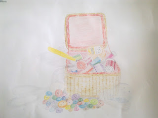
The first still life I did was the basket of threads with buttons. I think I made a good selection of objects but there were too many (& unnecessary) buttons!. I chose the basket to practice frottage and produce texture, the scissors to produce an interesting shadow, the daylight light bulb to introduce transparency, the rayon threads because their sheen surfaces reflect light nicely and the buttons to try and cheer up the drawing and have something at the base of the basket. There were too many buttons in the end but I liked the bright and cheerful dimension they gave to the drawing.
The second still life were the leeks and I deliberately chose only 2 to give me a good change to study the natural shadows, reflections and textures which I knew I would find more challenging to do. I also saw the opportunity to do some negative space technique.
Do your drawings for well on the paper or could they be improved by working on a larger sheet of paper?
I was at the limit of my comfort zone drawing on A2 paper. I don't think at this stage of my learning I could produce anything on a larger piece of paper without a lot of practice first.
Did you have problems with drawing or find hatching too difficult.
No. These are all new skills to me. I am the sort of person who thinks that there is no reason why I should not be able to do something so it would not occur to me to think that I am having a 'problem' with any of the learning. My view is that I am learning new skills, am comfortable with what I am learning and however I learn and whatever skill I develop it will be to the best of my ability at that moment on time. I am a positive person when it comes to learning.
P1 Project: Enlarging An Image - Check and Log

Fairly successful. I was pleased with the results. This technique appealed to my mathematical brain. I found the technique easy to do.
Are you satisfied with your larger replica of the image/ What would you do differently another time?
Yes, I am satisfied with the results so I am not sure I would do things any differently next time.
P1 Project: Using Textures - Check and Log


Using lines and marks, crossing and cross-hatching builds texture. Also using the side of the pencil lead as well as the tip created different effects. Also using colour and rubbing the paper over a textured surfact created interesting results. I used a corrugated paper surface (give to me to protect a hot cup of coffe from a take-out cafe) and then realised that at home I had interesting baskets, conservatory furniture which could laster be used as a basis for interesting textures.
I guess also different types of paper might produce intersting textures and perhaps markig the surface of the paper might do as well - eg scratching it, etc. Or some papers may be rougher / smoother than others.
so my conclusion is yes, I have discovered new ways of using my drawing tools.
How successful were you at implying form with little or no tonal hatching?
I have to say I was tired when I did the drawings for this project so was not at my best. The assignment has been taking up most of my thoughts and I've wanted to get through these last sets of exercises quickly to make sure I have plenty of time and a peaceful mind to do the assignment. So, the results of this exercise were not great and I learnt by that.
What are your impressions of frottage as a drawing technique?
Simply - I LOVED IT. I loved doing this and it will be a technique I use in my assignements.
8 January 2011
P1 Project: Still Life - Check and Log


I think it is probably easier to suggest three dimensions on man-made objects rather than natural objects. The reason being that man made objects are mainly produced from geometrical shapes eg cubes, cylinders, cones often with regular shapes and lines which are easier to represent and draw whereas natural objects are often irregular so the three-dimensional aspect of them is more subtle.
How did you create a sense of solidity in your composition.
In the drawing of the man-made objects, I used a soft 4B pencil and different density of hatching to create depth and solidity. In the drawing of the natural objects, a collection of cheeses, I used different shades of yellows, oranges, browns and reds to produce effects of solidity.
Do you think changing the arrangement of your composition makes a difference to your approach and the way you create a sense of form?
Yes. It is interesting how some arrangements don't feel comfortable to draw but others do. Often it is about perspective and seeing how shadows fall.
How did you decide to position yourself in relation to the objects?
Firstly feeling comfortable is very important, then having light sources in the best positions to highlight the forms, shadows, colours. Also being able to see the shapes in a form that I recognise I can draw is important.
Subscribe to:
Posts (Atom)