25 February 2011

Assignment 1 - Tutor feedback


Tutor Report Form

Student name:
Lesley O’Malley
Student number:
506748
Course/Module title:
Drawing 1
Assignment number:
1


General comments

In general I would expect a higher level of work for assignment 1 even with no formal qualifications in art. From our correspondence you seem to be very concerned with your level and in just passing the course in order to do other things. If you do want to pass you need to approach what you do in a fully committed manner. You will have to be brave and try new ways of working with different media in a much more open, expressive and for you experimental ways. Drawing is as much about perception and how we see things in the world and finding equivalents for them on paper.

The reasoning behind how this course is organized is that having done the exercises and projects you can bring the experience, knowledge and know how into the resultant assignment pieces. It is crucial that you remember this concept as you progress. Some of the projects might well be ambitious pieces also. It is imperative that you apply yourself fully to the exercises and projects.

Tone and form are essential elements found in good drawing and are together with mark making, a good understanding of light source and composition the fundamentals to producing effective interpretations of what we see.
From what you have sent me and on the work on the oca website you need to come to terms with these ideas in a thorough and practical way in order to get the most out of the course. You need to improve radically your understanding of these fundamentals of drawing.

I am not going to comment on individual pieces as you have already had one tutor who has done this already.

However, I am going to give you some very specific pointers/ instructions in both practical and perceptual terms that you need to implement straight away in order to increase the qualitative level that you are currently operating on. This is possible with some hard work and the right attitude.

Try outs using different media need to experimental both in terms of outcome and what you are willing to try. You need to be much bolder.
You need to experiment more with the range of tone possible and with a greater variety of marks, hatching and varying line speed. Just press harder with your implement when you heed to. Use softer media at times and be bolder. Respond physically to what particular medium you are using.

Ellipses range from nothing to a full circle. They all must refer to eye level. If you look at a cylindrical object at eye level the ellipse would in fact be a line; looked at from directly above a circle. Ellipses are dependent on this principle and range between the two depending on eye level.

When employing parallel perspective, parallel sides recede to a vanishing point which may or may not be off the paper. Again most artists will not grid up their work with vanishing points but will look very hard and use their eyes to determine correct perspective. This is drawing.

You do need to look very hard when you draw, draw what you see, not what you think that you see. If it doesn’t look right you need to alter, re draw, re look until you get the objects operating in 3 dimensions effectively.

Try not to respect the edges of objects too much especially when working more tonally. Merging these areas more will help the object sit better in space and relate more pertinently to the ground. Let shadows peter out rather than abruptly stopping and break the line between object and ground.

Preparatory work is crucial to an artists practice and needs to be taken seriously in terms of investigating particular subjects through drawing.   They need to be exploratory in how you make them and open in terms of how you interpret what you are looking at through drawing.

Vary the speeds that you work as working quicker can often open up new ways of seeing as can holding your drawing implements differently.
Quickly executed drawings can be good and bad. Drawings made more slowly likewise.
It is the intent and nature of the outcome in reference to what your subject is and the quality of the drawing itself that matters.
Prep work should be done on sheets of varying sizes and in sketch books both employing a variety of appropriate media.

Vary the size of your formats and the texture of your paper. Paper with a tooth is good for charcoal as it will help you achieve more tonal breadth more efficiently. Use good quality cartridge paper mostly. The paper that you used this time has not got any bite to it and it’s a bit shiny, which is not helping you.

Use a variety of media, not just pencil. It is important that you get used to using charcoal on A2 (and pastel in assignment 2).

Your tonal range needs to be much wider in order to establish objects in 3 dimensions. Half close you eyes to make the distribution of tone a little clearer. Then draw them! Map them out without too much detail initially.

Work on the relationships of one object to another and then to the whole, DO NOT concentrate on irrelevant details too soon which can be distracting to the whole composition.


Try to apply the drawing media much more boldly where necessary, for example when making a tonal drawing, work in tone. When working in line allow them to be varied and flowing.

Find equivalents in terms of mark making for what you are looking at especially when not employing cross hatching which you do much less when using charcoal and pastel as opposed to pens and pencils.

Work vertically, especially when working above A3 size, holding your implements between thumb and forefinger i.e. NOT like a pen when you write.

When working in colour, shadows are a mixture of object colour and ground colour and variations thereof. Each coloured object or thing will have an effect on objects in proximity and indeed to the whole.

Layer your colour much more to achieve this i.e. apply more stuff to the drawing, work over, change work again to build up the relationships and the 3 dimensional feel. You have to work here it will not happen by magic especially when using coloured pencils. Pastels, you can build up more quickly just by their nature, but you still need the layering.

It is imperative that you look hard at all times at your subject; look draw, alter, draw again, change, look, you need to build up a dialogue between yourself, the subject and the particular medium that you are using. Different media require different approaches as do different subjects. It is good to build your drawings in this way.

DO NOT be afraid to make mistakes as this is an important part of the drawing, and indeed the creative process. Leave the rectified mistakes in your drawing, this will make your drawings richer and give them a history.

You need to be considering composition at all times when you work. Composition is basically internal relationships sitting effectively within a whole. You need to consider, viewpoint, eye level, scale, overlapping, tone, line and colour.

It is important that if you see something that bothers you in a drawing that you change it visually and not write it in words. Drawing is a visual expression and you need to get into the habit of working in visual terms not literal ones.

You need to be keeping sketch books to augment your work. These need to be full of genuine inquiry pertaining to what you are doing and any other visual notations that you are interested in. I would advise actually using books as they do have a certain role to play in the creative process which is different than working on sheets.

A learning log is a professional document to assist you in your learning and to some extent give you a context.
A learning log should contain objective writings about your work, analytical and comparative is best with comments on ‘what have you achieved’. It needs to have in it the set theoretical studies and research points. Evidence of artists and work that you have looked at and art that you have seen annotated where necessary.  Put images of other artists work in as well as your own. The learning log is there to help you develop as a practitioner. It has to be more than just a narrative.

Suggested reading/viewing

Look at as much art as possible as this will help give you a context in a wider sense. Look at Cezanne, Degas, Durer and Matisse. The drawings of Seurat and Van Gogh will help you in terms of tone, mark making and colour. Look at them as a PRACTITIONER not a connoisseur. Ask yourself. How did they do that? And try to use aspects in your own drawings.

Other

You do have a lot of work to do to raise the qualitative level of what you are producing at the moment. My advice would be to do assignment 2 implementing my suggestions and then seeing what results.

Drawing is a fundamental discipline no matter what part of the visual arts you are involved in. You would most certainly have to do a drawing module if you were embarked on a full time textiles course for example.


Tutor name:
Jim Unsworth
Date
25th February 2011
Next assignment due
1st May 2011


22 February 2011

P2 Project Detailed Observation - Check and Log

I made the mistake of peeking at another student's work and then realised how far I have to go to draw well. But I keep reminding myself that I am really a Textile artist and the reason for doing this drawing course is to improve my sketching and drawing skills which I feel I have done.


So what's happened since the last post.


Well I managed to dust myself down and get up again and start drawing. And here we are, someway through Part 2. My latest drawings have been uploaded to the student website and it's now time to reflect on the drawings I have done for this project - Detailed Observation.


In general I am still finding it hard to translate what I see (and I am noticing more detail) to a drawing. The eye to hand conversion is not working too well.


So..


Which drawing media did you find the most effective to use, for which effects?
What sort of marks work well to create tone, pattern and texture?


For drawing a clean outline of an object (in my case the onion), i found the fibre tipped pen really effective because no sooner is the line drawn that the ink has dried. The downside it very unforgiving so great concentration is needed to make sure that mistakes are not made. The limited range of colours these pens come can either be a blessing (great, not too much choice!!) or limiting (eeek, I need more shades to get the look I want!!).


In the second exercise where we were told to use a soft pencil and do a drawing on A3 presented itself with a number of problems. First I misunderstood the bit about the soft pencil and tried to draw a shell in black soft graphite pencils (this is the point I looked another student's drawing and realised mine was just rubbish) and drawing a shell in A3 was just way outside my comfort zone. I became quite despondent and actually left the drawing for 10 days before talking myself back into the course. At this point, I rubbed out most of the black pencil and went over in soft graphite coloured pencils using a variety of shades of ochres, browns, oranges, reds and blue to bring out the tone and depth in the shell. I'm not convinced the result was great but the change to the coloured pencils defintely made a difference.


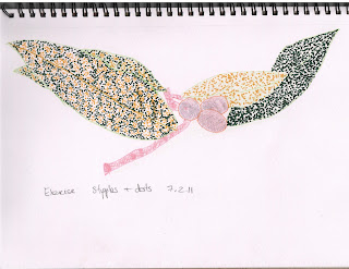
In the 3rd exercise, I used 2 fine markers (yellow and green) to try and draw stipples and dots to give effect of a bunch of Aucuba (Spotted Laurel leaves). i thought it was going to take all night to fill the leaves and you will see that each leaf has a different effect as I experimented with stipplig with and wihout the help of underneath shading from a soft pencil. I really don't think this technique worked for this example and in future I will leave stipples and dot effects for creating texture in a small area.


Did you enjoy capturing details or are you more at home creating big broad brush sketches?


I am defintely more at home with small scale detailed drawings


Look at the composition of the drawings you have done in this project. Make some sketches and notes about how you improve your composition


I am happy with my compositions so far.


Did doing a line drawing get you to look at space more effectively?


Yes, definitely.

8 February 2011

P2 Project: Detailed Observation exercises

Line drawing detail exercise
2. Getting tone and depth in detail exercise


3. Stipples and dots exercise


30 January 2011

P2 Project: Exploring coloured media - Check and Log

Which of the media you have experimented with did you find most expressive. Make notes in your learning log on the pros and cons of each medium.

I have found pencil to be t most expressive. You can use pressure or density of lines / hatching / shading to express different textures and tones.

Pros and Cons of Pencil: Pencil is very flexible and easy to work with and great for detail drawing. Also you can rub out mistakes. but it is hard work to work large areas and you can't smear pencil to create a blended effect.

Pros and Cons of Charcoal: I do not like charcoal at all - too messy for me so no pros for I'm afraid.

Pros and Cons of Pastel: I don't think i used pastels correctly. I used them on a smooth paper so they seemed to stick and be bitty. Having researched using pastels on the Internet, I have learnt that pastels work best on rough paper. It's very hard to erase though it smears and blends pretty easily. 

Pros and Cons of Watercolour: I could not make my watercolour pencils work. I need to do more research to understand. I have seen the effects of watercolour pencils and love the delicate colour wash effect they can give. I love the idea that you can get a watercolour effect without using a brush.I will be persevering with this method.

Pros and Cons of Ink: I quite like ink but can see problems in its permanence. For detail drawing it is great bu if you make a mistake, that's it.

Which medium do you think lends itself to very detailed work?

Definitely pencils and ink

Which techniques, tools and effects do you particularly enjoy? Make notes about your experiments.

I find cross hatching easy to do but difficult to get the right effect. I need to practice a lot more. I liek drawing lines - this tend to be how I doodle. I also really like shading using the side of the pencil because you can fill a large space quickly. In general though, I think I am doing OK.


25 January 2011

P2 Project: Exploring coloured media exercises

I enjoyed this start to Part 2. I used all the varieties of coloured pencils / pens / crayons I had and it was tremendous fun. I really like using colour and think this will be the direction I follow.


PART 2 OBSERVATION IN NATURE - THE START

Assignment 1 was posted off last Thursday, just in time for the deadline of Friday! And what a great sense of satisfaction I felt. I had a bit of a panic when I realised that BLOGGER has no PRINT facility but the office assure me that it is not necessary to print off the Blog.

And so onto Part 2 Observation in Nature.

What I have learnt from working through Part 1, is that I must read through the whole of the Project section right through to the end of the Check and Log questions before starting any of the exercises.

I am looking forward to starting this next part.

20 January 2011

ASSIGNMENT 1 REFLECTIONS


Assignment 1 - First Drawing Natural Forms

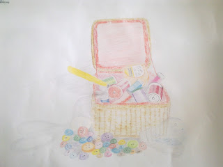
Assignment 1 - Second Drawing Man Made Objects


Did you do enough preliminary work before starting work on your final piece?

No, is the simple answer. I was anxious that I would have to rush the assignment, so I spent quite a lot of time thinking about it, about what I was going to draw so that by the time I was ready to do it, I had already decided in my mind what I wanted to do. I did not document these thought processes so when I came to do the assignment, I was already doing the preparatory work in retrospect, if that makes sense. I did however go through the motions of doing the rough sketches as described in the assignment. I did find it useful to look at the sketch and before starting the actual assignment drawing to consider what techniques I had learnt in the past few months and how I was going to incorporate them. By doing the rough sketches, I also decided I would do the assignment in colour which made me check all my pencils and collect together a good selection of shades etc. So although in drawing terms I don't think I did enough prelim work, in thinking terms I was well prepared and knew what I was going to do before starting the assignment.

Do your large drawings give an accurate interpretation of the still life groups? If not, what went wrong?

I am extremely pleased with my results. Three months ago I had never drawn anything. Even at school I was transferred from the painting class to the textile class at 14 years old because I was not good enough at drawing / painting. I cannot believe that I have produced the drawings. I am really pleased with my results but realise that they probably fall very short of undergraduate work so I welcome all feedback.

Did you make a good selection of objects or did you try and include too much? Would you change the arrangements of the objects if you were to start again?

The first still life I did was the basket of threads with buttons. I think I made a good selection of objects but there were too many (& unnecessary) buttons!. I chose the basket to practice frottage and produce texture, the scissors to produce an interesting shadow, the daylight light bulb to introduce transparency, the rayon threads because their sheen surfaces reflect light nicely and the buttons to try and cheer up the drawing and have something at the base of the basket. There were too many buttons in the end but I liked the bright and cheerful dimension they gave to the drawing.

The second still life were the leeks and I deliberately chose only 2 to give me a good change to study the natural shadows, reflections and textures which I knew I would find more challenging to do. I also saw the opportunity to do some negative space technique.

Do your drawings for well on the paper or could they be improved by working on a larger sheet of paper?

I was at the limit of my comfort zone drawing on A2 paper. I don't think at this stage of my learning I could produce anything on a larger piece of paper without a lot of practice first.

Did you have problems with drawing or find hatching too difficult.

No. These are all new skills to me. I am the sort of person who thinks that there is no reason why I should not be able to do something so it would not occur to me to think that I am having a 'problem' with any of the learning. My view is that I am learning new skills, am comfortable with what I am learning and however I learn and whatever skill I develop it will be to the best of my ability at that moment on time. I am a positive person when it comes to learning.